
Monday, June 4, 2012

Saturday, June 2, 2012
Veterum Non Immemor
I recently spent an afternoon along the banks of the Credit River in Port Credit, ON, scouting potential painting sites. I had gone with a couple of places specifically in mind, but they left me somewhat disappointed. I sat for a while sketching ducks, geese and swans on the river, and prepared to head home. On my way to the station, I was struck by this scene.

"What?", you ask. Well, it's a small building, made of river stone and concrete. (The river is only about 300 meters away.) It's actually built into the side of a hill, the long-ago bank of the river. Behind it, on the top of the ridge, is a cemetary. I think this is a charnel house, the building where bodies were stored through the winter when the ground was frozen too hard to dig. And on the lintel is the inscription, which I did not attempt to render, "Veterum Non Immemor." I think a rough translation might be "the past is not forgotten," or something to that effect. Times like this I wish I'd taken high school Latin; if you can offer a more accurate translation I would appreciate it. I plan to do some research at the adjoining church to see if I can dig up a little history.
This is oil on a 9 x 12 panel. I think one of the things that really grabbed my attention was the strong contrast between the bright blue of the sky and the intense red of the bush, as well as the lost, half-forgotten, overgrown appearance of the structure. In the midst of a bustling village, it was somewhat lonely. I know the composition needs work, but this is one sketch that I really look forward to working up into a larger painting.

"What?", you ask. Well, it's a small building, made of river stone and concrete. (The river is only about 300 meters away.) It's actually built into the side of a hill, the long-ago bank of the river. Behind it, on the top of the ridge, is a cemetary. I think this is a charnel house, the building where bodies were stored through the winter when the ground was frozen too hard to dig. And on the lintel is the inscription, which I did not attempt to render, "Veterum Non Immemor." I think a rough translation might be "the past is not forgotten," or something to that effect. Times like this I wish I'd taken high school Latin; if you can offer a more accurate translation I would appreciate it. I plan to do some research at the adjoining church to see if I can dig up a little history.
This is oil on a 9 x 12 panel. I think one of the things that really grabbed my attention was the strong contrast between the bright blue of the sky and the intense red of the bush, as well as the lost, half-forgotten, overgrown appearance of the structure. In the midst of a bustling village, it was somewhat lonely. I know the composition needs work, but this is one sketch that I really look forward to working up into a larger painting.
Wednesday, May 16, 2012
Apples in Oil
My good friend, Barry Coombs, just posted a blog article with some watercolour demos of apples. I thought I would share a recent demo for some of my students, done as an experiment with water-miscible oil paints. I don't paint still life often enough, and it's a very rewarding experience. Any painting activity that focuses on direct observation and colour mixing problems is bound to be beneficial, in the long run. Sometimes students complain that they've done still life, that's over, but it's all good practice!


Thursday, April 26, 2012
Silent Auction
The Neilson Park Creative Centre recently held a silent auction fundraising exhibition, in which I participated. The Square Foot show required only that the pieces all be 12 x 12 inches. Medium, support, subject (or not) was all completely open. I believe there were over 100 entries altogether. I am pleased to report that my piece sold, and I'm glad I was able to support one of my community's arts organizations. This is Tomahawk #3, acrylic on panel. Tomahawk Island is in Georgian Bay, near Georgian Bay Islands National Park, and is privately (corporately?) owned by the Tomahawk Club, founded in 1895.


Wednesday, March 28, 2012
Playing With Oils
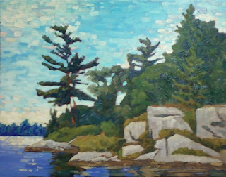
I have hardly touched oils in many years, for a variety of reasons. Mostly, for the past few years I have been concerned about solvents, as my studio space is both small and poorly ventilated. A year ago I picked up some M. Graham oils, because the walnut oil base can be cleaned up with soap and water, I thought perhaps a big plus. There were some challenges, from both the aspect of re-aquainting myself with the medium and the the particular feel of these specific paints. But I have managed a few successes, I think, such as "From the Channel." (16 x 20)
 Recently I picked up a few water-mixable colours, because I am a bit intrigued, and I wondered about using WMO mediums with standard oils. So I did a sketch, using some elderly paints from my student years and a couple of really cheap bristle brushes that I had received as a gag gift. I used a simple triad palette of Ultramarine Blue, Permanent Rose, Yellow Ochre and Zinc White, with Winsor & Neweton's Artisan Fast Drying Medium and Artisan Safflower oil. I gave an 8 x 10 panel a thin imprimatura with a bit of Fast Drying Medium and a mixture of Rose and Ochre, and let it dry for about an hour. The initial drawing was executed with FDM and a dark dull purple, then all the overpainting was done without any more medium. This is a quick sketch, about an hour. I washed the brushes out in the Safflower oil and then again with mild soap and water, and the brushes cleaned up like a dream. And I got a reasonable sketch out of the experiment.


Wednesday, February 22, 2012
Two In A Row
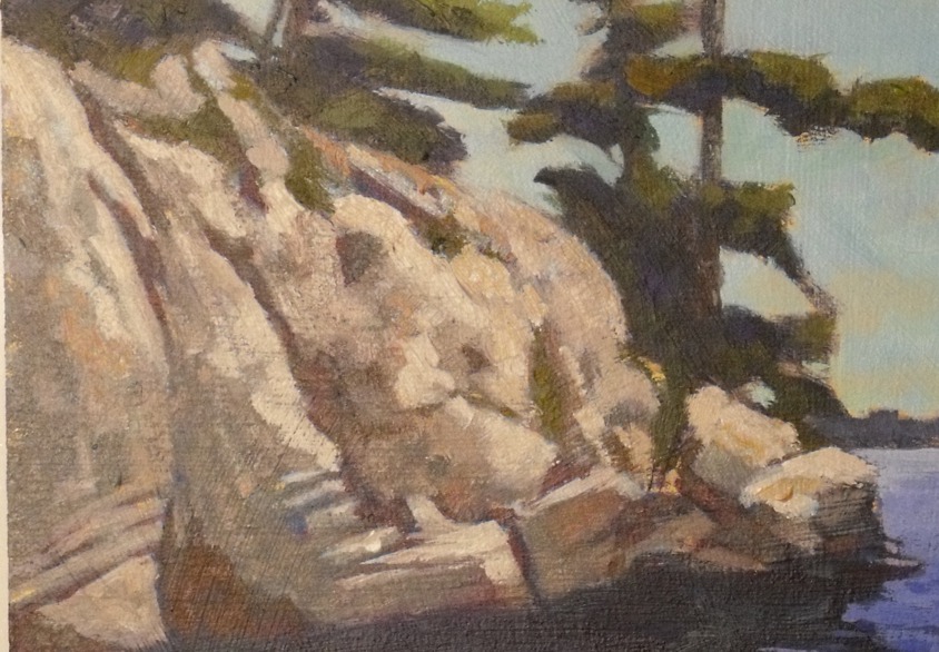
I'm pleased to report that I have recieved an Honorable Mention for the second consective time in an on-line painting challenge at Artist Mentors Online. The challenge this time was produce a painting without using a brush. Finger painting was encouraged, as was palette knife use. My offering is a an oil sketch, 9" x 12".

I've never been terribly fond of the palette knife as an actual application tool, but I gave it a go, as well as fingers, Q-Tips, cut up credit cards, paper towels and corrugated cardboard. I will admit that I was surprised at how pleased I was with the results of the knife on the the large rock shape.
You might notice that this painting resembles the image from my previous post. In truth, this one was done first, as a memory exercise; I used no reference. It seems to me that a memory exercise like this is valuable in a couple of ways. One, it tests your powers of observation. Have you really been looking, or just passing through? Secondly, it will emphasize the elements that attracted you to the image in the first place, the elements that inspired you.
My only visits to this area of Georgian Bay have been in full, sunny daylight, and I've never been at this place in a storm, so I don't what possessed me to create the stormy atmosphere, but I think this is a successful concept. I'll likely paint a larger, more finished piece based on this sketch. I might even use some palette knife...

I've never been terribly fond of the palette knife as an actual application tool, but I gave it a go, as well as fingers, Q-Tips, cut up credit cards, paper towels and corrugated cardboard. I will admit that I was surprised at how pleased I was with the results of the knife on the the large rock shape.
You might notice that this painting resembles the image from my previous post. In truth, this one was done first, as a memory exercise; I used no reference. It seems to me that a memory exercise like this is valuable in a couple of ways. One, it tests your powers of observation. Have you really been looking, or just passing through? Secondly, it will emphasize the elements that attracted you to the image in the first place, the elements that inspired you.
My only visits to this area of Georgian Bay have been in full, sunny daylight, and I've never been at this place in a storm, so I don't what possessed me to create the stormy atmosphere, but I think this is a successful concept. I'll likely paint a larger, more finished piece based on this sketch. I might even use some palette knife...
Wednesday, February 1, 2012
Back to Class
I statred teaching again last week and had a very pleasant surprise. Winter can often be a tough time to cajole students to get out, and I expected a minimal number of students for the term, but I came in to a class of 15! It's great to see a bunch of new faces, and a few previous students.
We're working on a class titled the Spirit of Seven. It's an attempt to follow in the steps of the Group of Seven and Tom Thomson, very influential Canadian painters from the early part of the 20th century. Much of their early work was done in Central Ontario, Algonquin Park and Georgian Bay, and further north, in the Algoma region north of Lake Superior. The focus was very much on the ruggedness of the Canadian Sheild landscape.
My demonstration is from Tomahawk Island, on Georgian Bay. This scene exemplifies the subject matter of a great deal of the early work of the Group, and especially Thomson - the rough granite of the Sheild, Eastern white pine, cold lake water and an often brilliant sky.
 This is acrylic in masonite, 12 x 16. I started with a dull gold wash, or imprimatura, over the entire board. A silhouette of the major shapes was washed in using a large synthetic bristle and a thin ,dull purple. Then, using a similar purple in a thicker mixture, I indicated my darkest shadows. All my drawing was done with brush and paint, a very direct approach. The sky area was roughly brushed in, using some of those colours to help refine the tree shapes. The trees were roughly blocked in with a variety of mixed greens. (I rarely use a tube green.)
The rocks were built up in several layers of various colours. Over the initial wash drawing a more comprehensive lay-in was done with a variety of dull violet-grays in an attempt to flesh out the forms in the rock face.. Over this underpainting I built up layers of warmer colour, often dragging and scumbling to enhance the texture of the rock. The lightest areas are built up in a more impasto method.
 The water was blocked in as a simple gradated shape with a little break-up in the foreground to indicate ripples and waves. The darks here are all the original dark washed in underpainting. The background far shore was initially laid in as part of the overall darkish silhouette, and I simply scumbled a thin pale blue over that area to push it back. Voila! Tomahawk Rocks.
We're working on a class titled the Spirit of Seven. It's an attempt to follow in the steps of the Group of Seven and Tom Thomson, very influential Canadian painters from the early part of the 20th century. Much of their early work was done in Central Ontario, Algonquin Park and Georgian Bay, and further north, in the Algoma region north of Lake Superior. The focus was very much on the ruggedness of the Canadian Sheild landscape.
My demonstration is from Tomahawk Island, on Georgian Bay. This scene exemplifies the subject matter of a great deal of the early work of the Group, and especially Thomson - the rough granite of the Sheild, Eastern white pine, cold lake water and an often brilliant sky.

The rocks were built up in several layers of various colours. Over the initial wash drawing a more comprehensive lay-in was done with a variety of dull violet-grays in an attempt to flesh out the forms in the rock face.. Over this underpainting I built up layers of warmer colour, often dragging and scumbling to enhance the texture of the rock. The lightest areas are built up in a more impasto method.
Subscribe to:
Posts (Atom)