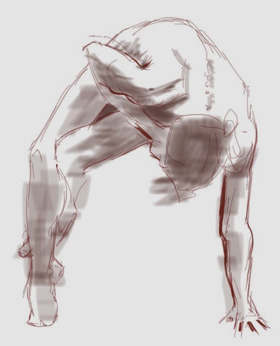
I'm continuing to work digitally in the Open Life Drawing Studio at Visual Arts Mississauga. I think it's really pushing me to improve my digital drawing and painting skills. A few examples from tonight's session, all done using SketchBook Pro and a Wacom tablet.
Showing posts with label painting. Show all posts
Thursday, March 20, 2014
More Life Drawing
Labels:
digital,
drawing,
female,
figure,
nude,
painterly,
painting,
Sketch Book Pro,
Visual Arts Mississauga
Friday, February 21, 2014
The Digital Life
I realize I haven't posted here for quite some time, but this seems like a good opportunity. I decided the time had come, and last night I took my computer and tablet to the Open Life Studio at Visual Arts Mississauga. Wow, was I ever pleased with both the results and the potential for the future.
It's a very different feel, working on a tablet with an active area of about 5 1/2" x 9" compared to an 18" x 24" pad on an easel. One of the advantages I was hoping for was to be able to do something more painterly in the longer last pose without the fuss of setting up painting materials and clean-up afterwards. It also meant a very easy switch between "tools," so I was able to move back and forth between pencil, marker, pen and wash. It made for a varied evening.
All of these examples were made using a Wacom Intuos Pro medium tablet and SketchBook Pro 6. Let me know in the comments what you think.
It's a very different feel, working on a tablet with an active area of about 5 1/2" x 9" compared to an 18" x 24" pad on an easel. One of the advantages I was hoping for was to be able to do something more painterly in the longer last pose without the fuss of setting up painting materials and clean-up afterwards. It also meant a very easy switch between "tools," so I was able to move back and forth between pencil, marker, pen and wash. It made for a varied evening.
All of these examples were made using a Wacom Intuos Pro medium tablet and SketchBook Pro 6. Let me know in the comments what you think.
Labels:
digital,
drawing,
figure,
nude,
painting,
Sketch Book Pro,
Visual Arts Mississauga,
Wacom
Monday, June 24, 2013
Life Studio Wrap-Up
For several months a number of friends and colleagues have been getting together on the last Sunday of the month for a life drawing/painting session. Yesterday was the last session before a long summer break - we won't get together again, at least in that setting, until the end of September. We didn't have a large turnout, only six of us, but there was some very good work accomplished.
I chose to tackle the water miscible oils again. I'm really enjoying them, and I love walking into my studio to be met by the odour of oil paint. I suspect I will be painting less often with acrylics in the future.
This is a small study, 12"x16", on a previously enjoyed canvas panel. I framed the face with the hair and dark clothing first, blocking it in very quickly, trying to get the big shapes in the right proportion to one another. Then came the longer, often frustrating construction of the face itself - reshape that cheek, warm up the nose, scrape off the eyes and try again, try to get that little quirk in the corner of her mouth... It just goes on and on, until either time runs out or you don't think there's anything else you can do, short of starting fresh.
Don't get me wrong, there is nothing to compare with joy of creating an image, either on paper or canvas or the digital screen. But don't let anyone ever tell you it isn't work!
To be honest, while the likeness to the model is evident, it's not a very good portrait. But as a painting exercise I'm quite pleased. And I can't wait to get together with my painting buddies again in the Fall.
I chose to tackle the water miscible oils again. I'm really enjoying them, and I love walking into my studio to be met by the odour of oil paint. I suspect I will be painting less often with acrylics in the future.
This is a small study, 12"x16", on a previously enjoyed canvas panel. I framed the face with the hair and dark clothing first, blocking it in very quickly, trying to get the big shapes in the right proportion to one another. Then came the longer, often frustrating construction of the face itself - reshape that cheek, warm up the nose, scrape off the eyes and try again, try to get that little quirk in the corner of her mouth... It just goes on and on, until either time runs out or you don't think there's anything else you can do, short of starting fresh.
Don't get me wrong, there is nothing to compare with joy of creating an image, either on paper or canvas or the digital screen. But don't let anyone ever tell you it isn't work!
To be honest, while the likeness to the model is evident, it's not a very good portrait. But as a painting exercise I'm quite pleased. And I can't wait to get together with my painting buddies again in the Fall.
Labels:
female,
figure,
oil,
painterly,
painting,
portrait,
water miscible,
water mixable,
water soluble
Wednesday, January 30, 2013
Mixed Media
I've been considering trying to do something with oil pastels for a little while, and my friend Aleda O'Connor, who has worked with them for some time, was very encouraging. Much as I love Aleda's approach (and I urge you to check out her blog) I wanted to do something different with them.
Recently, with my acrylic landscapes, the surface texture of the painting has become more and more important to me, to the point where I now regularly texture my panels with various rough grounds and use thick paint where I can. I was hoping that using oil pastels over top of such an acrylic underpainting would yield some interesting results.
So, during a recent landscape class, I coated an acrylic underpainting with clear gesso and took the oil pastels to it. I was very pleased with the results.
I have also been looking for an approach to figure painting that would allow me a more expressive, gritty feel. I took an abandoned demo of a landscape underpainting and coated it with a pastel ground. I made a very rough, blocky carbon pencil drawing of a figure and overpainted thin acrylic washes to emphasize warm and cool areas, then went to town with the oil pastels. Again, I am very pleased with this little experiment, I think it shows a lot of promise.
Next, I'm going to try some still life or floral compositions, and see how those suit me. I may be on to my next obsession...
Recently, with my acrylic landscapes, the surface texture of the painting has become more and more important to me, to the point where I now regularly texture my panels with various rough grounds and use thick paint where I can. I was hoping that using oil pastels over top of such an acrylic underpainting would yield some interesting results.
So, during a recent landscape class, I coated an acrylic underpainting with clear gesso and took the oil pastels to it. I was very pleased with the results.
I have also been looking for an approach to figure painting that would allow me a more expressive, gritty feel. I took an abandoned demo of a landscape underpainting and coated it with a pastel ground. I made a very rough, blocky carbon pencil drawing of a figure and overpainted thin acrylic washes to emphasize warm and cool areas, then went to town with the oil pastels. Again, I am very pleased with this little experiment, I think it shows a lot of promise.
Next, I'm going to try some still life or floral compositions, and see how those suit me. I may be on to my next obsession...
Wednesday, November 7, 2012
Acrylic Step-by-step
I originally painted this several months ago for a school group presentation at Visual Arts Mississauga, an introduction to creating a painting from the ground up, as it were. I've since been asked to add some explanatory text to the step-by-step photos and post it for others, so here goes.
There are some general guidelines worth keeping in mind, not just for landscape, but for most painting:
Paint from the big shapes to the smaller details - don't get trapped in each and every detail at the first stage. Use large brushes at first, switching to smaller as you need to add detail or refinement. (You may find, as you go along, that there are lots of details that can be left out.) You don't have to paint every leaf and flower petal - leave the greatest detail for your focal area.
Paint from thin to thick, transparent to opaque. Shadows are usually most effective if they are somewhat transparent. Avoid adding white to your shadow colours until you need to modify the colour and/or the light later on in the painting process.
Lay down your brush stroke, and leave it alone. Don't mush your brush back and forth along the same stroke; that destroys all the character of the stroke. And do try to stroke, not jab, dab or stab.
Consider your composition first. It's important to go into the painting stage with a plan, so several thumbnail drawings of your subject are always a good idea. These are small, simplified drawings, with no concern for detail, but looking at balance, shapes, arrangements of lights and darks, etc. Interesting composition tends to avoid placing your centre of interest actually right in the centre of your painting! A good starting place is to divide your canvas into thirds, both horizontally and vertically. The points where the thirds meet are good focal areas.
The first thing I like to do with my canvas is give it a thin wash of colour all over, very roughly. This is called the imprimatura, and it gives you a mid-tone to work on, which makes it easier to judge your darks and lights. I usually do my initial drawing directly with a brush and thinned paint. In the example you can see how scrubbed on and rough the imprimatura looks. I have only concentrated on the big general shapes, nothing fussy.
The next stage is blocking in the darks. I tend to to use cool dark colours, at least in the beginning - blues, purples and cool greens. They can always be overpainted later if they need to be lightened a little or warmed up. Then, consider where the lightest light(s) will be. Often, this will be the sky. Now you have a pretty good idea of the range between the darkest dark and lightest light. Everything else will relate to these. The roof of the tower will eventually be fairly dark, but I don't want to lose it in the dark of the tree at this stage, so I'm going to leave it alone for now.
Notice that the sky is not a solid blue. It's lighter towards the horizon (and maybe a tiny bit yellowish) and the large areas of blue are broken up with some paler, almost white, shapes. I haven't tried to paint anything that looks like a puffy cloud, just the suggestion of clouds.
Now we get into the real landscape colour - green. It's very important to vary your greens. Look at how deep and rich the midground trees are, compared with how cool, bluish and paler the far background trees are. The hedges and lawns are much warmer, with more yellow and orange added. Some of the shadows have been modified to give them a little more colour and light. A point about brushwork - don't try to smooooth out all your strokes! An important part of the Impressionist approach is to have distinct brush strokes with varying colour side by side.
With a lot of the foliage taken care of it's time to look at the tower and bridge. Now I can look at the lights and darks of the architecture in relation to the surroundings. Even though the tower will be lighter than this in the shadows, I still want to be sure that I'm keeping the sides distinct from each other - light, mid-tone, and dark. I'm also starting to work in some of the colour on the paths and the far background buildings.
I can start to fill in the colour of the stonework now. I have no intention of trying to paint each individual stone and brick, but I want to leave a strong impression of the difference in texture between the tower and the trees. Individual strokes, laid down and left alone, are the key here. You can see that the shadow side of the tower is now considerably lighter than the previous step, but each side of the tower is still seperate. Can you see a hint of warm reflected light in the shadow side of the tower? I've also cleaned up the paths a little, with better definition of the lights and darks.
Some finishing touches and the sketch is complete. I've added more detail to the left side hedges, defined the distant tree trunks and added some sky reflection and accent darks to the canal.
Voila!
There are some general guidelines worth keeping in mind, not just for landscape, but for most painting:
Paint from the big shapes to the smaller details - don't get trapped in each and every detail at the first stage. Use large brushes at first, switching to smaller as you need to add detail or refinement. (You may find, as you go along, that there are lots of details that can be left out.) You don't have to paint every leaf and flower petal - leave the greatest detail for your focal area.
Paint from thin to thick, transparent to opaque. Shadows are usually most effective if they are somewhat transparent. Avoid adding white to your shadow colours until you need to modify the colour and/or the light later on in the painting process.
Lay down your brush stroke, and leave it alone. Don't mush your brush back and forth along the same stroke; that destroys all the character of the stroke. And do try to stroke, not jab, dab or stab.
Consider your composition first. It's important to go into the painting stage with a plan, so several thumbnail drawings of your subject are always a good idea. These are small, simplified drawings, with no concern for detail, but looking at balance, shapes, arrangements of lights and darks, etc. Interesting composition tends to avoid placing your centre of interest actually right in the centre of your painting! A good starting place is to divide your canvas into thirds, both horizontally and vertically. The points where the thirds meet are good focal areas.
The first thing I like to do with my canvas is give it a thin wash of colour all over, very roughly. This is called the imprimatura, and it gives you a mid-tone to work on, which makes it easier to judge your darks and lights. I usually do my initial drawing directly with a brush and thinned paint. In the example you can see how scrubbed on and rough the imprimatura looks. I have only concentrated on the big general shapes, nothing fussy.
The next stage is blocking in the darks. I tend to to use cool dark colours, at least in the beginning - blues, purples and cool greens. They can always be overpainted later if they need to be lightened a little or warmed up. Then, consider where the lightest light(s) will be. Often, this will be the sky. Now you have a pretty good idea of the range between the darkest dark and lightest light. Everything else will relate to these. The roof of the tower will eventually be fairly dark, but I don't want to lose it in the dark of the tree at this stage, so I'm going to leave it alone for now.
Notice that the sky is not a solid blue. It's lighter towards the horizon (and maybe a tiny bit yellowish) and the large areas of blue are broken up with some paler, almost white, shapes. I haven't tried to paint anything that looks like a puffy cloud, just the suggestion of clouds.
Now we get into the real landscape colour - green. It's very important to vary your greens. Look at how deep and rich the midground trees are, compared with how cool, bluish and paler the far background trees are. The hedges and lawns are much warmer, with more yellow and orange added. Some of the shadows have been modified to give them a little more colour and light. A point about brushwork - don't try to smooooth out all your strokes! An important part of the Impressionist approach is to have distinct brush strokes with varying colour side by side.
With a lot of the foliage taken care of it's time to look at the tower and bridge. Now I can look at the lights and darks of the architecture in relation to the surroundings. Even though the tower will be lighter than this in the shadows, I still want to be sure that I'm keeping the sides distinct from each other - light, mid-tone, and dark. I'm also starting to work in some of the colour on the paths and the far background buildings.
I can start to fill in the colour of the stonework now. I have no intention of trying to paint each individual stone and brick, but I want to leave a strong impression of the difference in texture between the tower and the trees. Individual strokes, laid down and left alone, are the key here. You can see that the shadow side of the tower is now considerably lighter than the previous step, but each side of the tower is still seperate. Can you see a hint of warm reflected light in the shadow side of the tower? I've also cleaned up the paths a little, with better definition of the lights and darks.
Some finishing touches and the sketch is complete. I've added more detail to the left side hedges, defined the distant tree trunks and added some sky reflection and accent darks to the canal.
Voila!
Labels:
acrylic,
impressionism,
impressionist,
landscape,
light,
painterly,
painting
Friday, October 5, 2012
Digital Figure Study
I continue to play around with painting in Photoshop, and I finally have a figure study I'm not embarassed to share. This is actually the third version of this image. I decided that I really needed to push the colour and texture a little to create a little more interest in an otherwise monochromatic painting, so I banged in some greens, blues and purples and massaged them into the original warm oranges and browns. A lot of this is experimenting and playing with the various brushes and settings that are available in Photoshop. I think it has a bit of that trashy paperback/pulp look from the 50s and 60s. Kinda fun...
My Fall painting class has started, so there should be some posts of acrylic landscapes again soon. But I'm not giving up on the digital world!
Thursday, September 6, 2012
More Digital
I spent a few days either side of the Labour Day weekend on Georgian Bay, and I felt it was time to attempt a digital landscape painting. All I had to do was look out the window, after all... Really this is just a quick study, not a full landscape, but I'm getting a better painterly feel for the medium. It's still pretty rough around the edges, but it's coming.
The physical size is about 10x13 inches, so I was working at about 50% to fit the entire image on my monitor. This helps with the principle of working broadly at the beginning of a painting, getting the big shapes and value relationships early, and not looking too closely at detail too soon. In fact, there is not really any fine detail in this painting, I left it in a very sketchy (in places nebulous) state, as the detail illustrates.
There is likely enough here that I could increase the size of the "canvas" and spend another hour or two making a much more detailed finished painting, but that was not the intent of the exercise.
I'm pleased with how this is going, but with any luck I'll have a couple of more traditional painting classes starting in a couple of weeks, so there will be more acrylic demos to show. However, the digital isn't going away; you'll see more soon.
Labels:
Georgian Bay,
landscape,
painterly,
painting,
Photoshop
Saturday, June 9, 2012
Water Miscible Oils
I've been playing a bit with water-miscible oil paint, also sometimes called water-mixable or water soluble. This is mostly due to concerns with using potentially harmful volatile solvents in a small, less-than-optimally ventilated studio. I've decided that I'm not convinced. There doesn't seem to be that much in the way of actual benefits, aside from the ease of clean up with soap and water. And I can do that with the M. Graham walnut-based oils anyway.
Washes done with water as solvent are really only practicable in the first layer of paint, and the wash doesn't look or feel anything like a turps or mineral spirit wash. You also want to be sure the water has completely evaporated before you start any overpainting, or you might compromise the paint layers. There are driers for these paints, but they are just as smelly and noxious as the alkyd driers for linseed oil paints. The cost is considerably less than most artist grade paint, more like student grade, so that makes one wonder about the longevity and quality of the products. So, the verdict from me seems to be: carry on in the old tradition, just be very careful with my solvent use.
This painting (9 x 12, masonite) was done with Lukas Berlin WMOs, which I got because they were on sale. There was a stickiness to the paint that was very uncomfortable, and when it had dried, the colour had sunk to a very matte finish over most of the surface. I'll use up the remaining paint, but I won't be eager to buy any more.
Washes done with water as solvent are really only practicable in the first layer of paint, and the wash doesn't look or feel anything like a turps or mineral spirit wash. You also want to be sure the water has completely evaporated before you start any overpainting, or you might compromise the paint layers. There are driers for these paints, but they are just as smelly and noxious as the alkyd driers for linseed oil paints. The cost is considerably less than most artist grade paint, more like student grade, so that makes one wonder about the longevity and quality of the products. So, the verdict from me seems to be: carry on in the old tradition, just be very careful with my solvent use.
This painting (9 x 12, masonite) was done with Lukas Berlin WMOs, which I got because they were on sale. There was a stickiness to the paint that was very uncomfortable, and when it had dried, the colour had sunk to a very matte finish over most of the surface. I'll use up the remaining paint, but I won't be eager to buy any more.
Labels:
bales,
field,
hay,
landscape,
oil,
painting,
water miscible,
water mixable,
water soluble
Saturday, June 2, 2012
Veterum Non Immemor
I recently spent an afternoon along the banks of the Credit River in Port Credit, ON, scouting potential painting sites. I had gone with a couple of places specifically in mind, but they left me somewhat disappointed. I sat for a while sketching ducks, geese and swans on the river, and prepared to head home. On my way to the station, I was struck by this scene.
"What?", you ask. Well, it's a small building, made of river stone and concrete. (The river is only about 300 meters away.) It's actually built into the side of a hill, the long-ago bank of the river. Behind it, on the top of the ridge, is a cemetary. I think this is a charnel house, the building where bodies were stored through the winter when the ground was frozen too hard to dig. And on the lintel is the inscription, which I did not attempt to render, "Veterum Non Immemor." I think a rough translation might be "the past is not forgotten," or something to that effect. Times like this I wish I'd taken high school Latin; if you can offer a more accurate translation I would appreciate it. I plan to do some research at the adjoining church to see if I can dig up a little history.
This is oil on a 9 x 12 panel. I think one of the things that really grabbed my attention was the strong contrast between the bright blue of the sky and the intense red of the bush, as well as the lost, half-forgotten, overgrown appearance of the structure. In the midst of a bustling village, it was somewhat lonely. I know the composition needs work, but this is one sketch that I really look forward to working up into a larger painting.
"What?", you ask. Well, it's a small building, made of river stone and concrete. (The river is only about 300 meters away.) It's actually built into the side of a hill, the long-ago bank of the river. Behind it, on the top of the ridge, is a cemetary. I think this is a charnel house, the building where bodies were stored through the winter when the ground was frozen too hard to dig. And on the lintel is the inscription, which I did not attempt to render, "Veterum Non Immemor." I think a rough translation might be "the past is not forgotten," or something to that effect. Times like this I wish I'd taken high school Latin; if you can offer a more accurate translation I would appreciate it. I plan to do some research at the adjoining church to see if I can dig up a little history.
This is oil on a 9 x 12 panel. I think one of the things that really grabbed my attention was the strong contrast between the bright blue of the sky and the intense red of the bush, as well as the lost, half-forgotten, overgrown appearance of the structure. In the midst of a bustling village, it was somewhat lonely. I know the composition needs work, but this is one sketch that I really look forward to working up into a larger painting.
Labels:
cemetary,
charnel,
Credit River,
landscape,
oil,
painting,
Port Credit,
Scott Cooper
Thursday, April 26, 2012
Silent Auction
The Neilson Park Creative Centre recently held a silent auction fundraising exhibition, in which I participated. The Square Foot show required only that the pieces all be 12 x 12 inches. Medium, support, subject (or not) was all completely open. I believe there were over 100 entries altogether. I am pleased to report that my piece sold, and I'm glad I was able to support one of my community's arts organizations. This is Tomahawk #3, acrylic on panel. Tomahawk Island is in Georgian Bay, near Georgian Bay Islands National Park, and is privately (corporately?) owned by the Tomahawk Club, founded in 1895.
Labels:
acrylic,
Georgian Bay,
landscape,
Neilson Park,
painting,
Scott Cooper,
Tomahawk Island
Wednesday, March 28, 2012
Playing With Oils
I have hardly touched oils in many years, for a variety of reasons. Mostly, for the past few years I have been concerned about solvents, as my studio space is both small and poorly ventilated. A year ago I picked up some M. Graham oils, because the walnut oil base can be cleaned up with soap and water, I thought perhaps a big plus. There were some challenges, from both the aspect of re-aquainting myself with the medium and the the particular feel of these specific paints. But I have managed a few successes, I think, such as "From the Channel." (16 x 20)
Recently I picked up a few water-mixable colours, because I am a bit intrigued, and I wondered about using WMO mediums with standard oils. So I did a sketch, using some elderly paints from my student years and a couple of really cheap bristle brushes that I had received as a gag gift. I used a simple triad palette of Ultramarine Blue, Permanent Rose, Yellow Ochre and Zinc White, with Winsor & Neweton's Artisan Fast Drying Medium and Artisan Safflower oil. I gave an 8 x 10 panel a thin imprimatura with a bit of Fast Drying Medium and a mixture of Rose and Ochre, and let it dry for about an hour. The initial drawing was executed with FDM and a dark dull purple, then all the overpainting was done without any more medium. This is a quick sketch, about an hour. I washed the brushes out in the Safflower oil and then again with mild soap and water, and the brushes cleaned up like a dream. And I got a reasonable sketch out of the experiment.
Labels:
Georgian Bay,
Group of Seven,
landscape,
oil,
painting,
Riverwood,
Scott Cooper
Wednesday, February 1, 2012
Back to Class
I statred teaching again last week and had a very pleasant surprise. Winter can often be a tough time to cajole students to get out, and I expected a minimal number of students for the term, but I came in to a class of 15! It's great to see a bunch of new faces, and a few previous students.
We're working on a class titled the Spirit of Seven. It's an attempt to follow in the steps of the Group of Seven and Tom Thomson, very influential Canadian painters from the early part of the 20th century. Much of their early work was done in Central Ontario, Algonquin Park and Georgian Bay, and further north, in the Algoma region north of Lake Superior. The focus was very much on the ruggedness of the Canadian Sheild landscape.
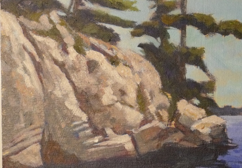
My demonstration is from Tomahawk Island, on Georgian Bay. This scene exemplifies the subject matter of a great deal of the early work of the Group, and especially Thomson - the rough granite of the Sheild, Eastern white pine, cold lake water and an often brilliant sky.
This is acrylic in masonite, 12 x 16. I started with a dull gold wash, or imprimatura, over the entire board. A silhouette of the major shapes was washed in using a large synthetic bristle and a thin ,dull purple. Then, using a similar purple in a thicker mixture, I indicated my darkest shadows. All my drawing was done with brush and paint, a very direct approach. The sky area was roughly brushed in, using some of those colours to help refine the tree shapes. The trees were roughly blocked in with a variety of mixed greens. (I rarely use a tube green.)
The rocks were built up in several layers of various colours. Over the initial wash drawing a more comprehensive lay-in was done with a variety of dull violet-grays in an attempt to flesh out the forms in the rock face.. Over this underpainting I built up layers of warmer colour, often dragging and scumbling to enhance the texture of the rock. The lightest areas are built up in a more impasto method.
The water was blocked in as a simple gradated shape with a little break-up in the foreground to indicate ripples and waves. The darks here are all the original dark washed in underpainting. The background far shore was initially laid in as part of the overall darkish silhouette, and I simply scumbled a thin pale blue over that area to push it back. Voila! Tomahawk Rocks.
We're working on a class titled the Spirit of Seven. It's an attempt to follow in the steps of the Group of Seven and Tom Thomson, very influential Canadian painters from the early part of the 20th century. Much of their early work was done in Central Ontario, Algonquin Park and Georgian Bay, and further north, in the Algoma region north of Lake Superior. The focus was very much on the ruggedness of the Canadian Sheild landscape.
My demonstration is from Tomahawk Island, on Georgian Bay. This scene exemplifies the subject matter of a great deal of the early work of the Group, and especially Thomson - the rough granite of the Sheild, Eastern white pine, cold lake water and an often brilliant sky.
This is acrylic in masonite, 12 x 16. I started with a dull gold wash, or imprimatura, over the entire board. A silhouette of the major shapes was washed in using a large synthetic bristle and a thin ,dull purple. Then, using a similar purple in a thicker mixture, I indicated my darkest shadows. All my drawing was done with brush and paint, a very direct approach. The sky area was roughly brushed in, using some of those colours to help refine the tree shapes. The trees were roughly blocked in with a variety of mixed greens. (I rarely use a tube green.)
The rocks were built up in several layers of various colours. Over the initial wash drawing a more comprehensive lay-in was done with a variety of dull violet-grays in an attempt to flesh out the forms in the rock face.. Over this underpainting I built up layers of warmer colour, often dragging and scumbling to enhance the texture of the rock. The lightest areas are built up in a more impasto method.
The water was blocked in as a simple gradated shape with a little break-up in the foreground to indicate ripples and waves. The darks here are all the original dark washed in underpainting. The background far shore was initially laid in as part of the overall darkish silhouette, and I simply scumbled a thin pale blue over that area to push it back. Voila! Tomahawk Rocks.
Labels:
acrylic,
Georgian Bay,
Group of Seven,
landscape,
painting,
Scott Cooper,
Tom Thomson,
Tomahawk
Wednesday, January 4, 2012
Completed Commission
I was approached last summer to create a painting of the Georgian Bay area for a client's new office. The initial request was proposed as "reasonably large", which got me thinking around 18 x 24 or maybe 22 x 28. Then I saw the actual wall and came home and cut a 24 x 36 panel. For me, that's big. After a couple of false starts things started coming together. Finally, after all the Christmas merry-making was done, I made a couple of requested changes and it's done. Even though it has been a few months in the making, it counts as my first finished painting of 2012. "Royal Island Stairway", acrylic, is taken from an island near the Georgian Bay Islands National Park, one of Canada's national gems.
Labels:
acrylic,
commission,
Georgian Bay,
landscape,
painting,
Scott Cooper
Tuesday, December 20, 2011
For My Students
At the end of my last class at Visual Arts Mississauga a couple of weeks ago, one of my students asked if there was some way I could post online to show her how I would go about finishing a demo that I had started; she wanted to see how I would solve some of the problems of water, in this case a sun splashed creek. So...
This is where we left off in class. I hadn't actually planned to do any more with this demo, and it was more than likely that the panel would simply have been gessoed over and used for another demo. (It could still happen...)
This was a bit hurried, as demos sometimes are. I probably rushed the glare on the water without doing more preparatory underpainting first, but I needed to move it along for the class. The foreground bank on the right hasn't been touched since the initial lay-in of colour, and I think the strip of glare in the background needs to be more contained in a curve of the bank, and the far b/g us totally understated.
Now the right-hand bank is more finished; it is still very much a suggestion, not a highly detailed depiction of rock and mud and undergrowth, but part of the focus in this class was on a more spontaneous look, not a laboured copy of the reference. The foreground surface of the water has more sky reflection on it now, streaked in places to indicate the movement of the water. Similarly, the midground water has been modified to show a bit more ripple and sparkle. There is some sun-dapple on the tree trunks, a bit of dapple on the left-hand bank, and some pale trunks have been suggested in the background foliage. The right-hand bank has brought around in a little bit of a curve to left to crop the strip of glare on the b/g water, but it has mostly been cropped in the photo (sorry!)
To create the illusion of transparency, I think the foreground water needs to be treated in layers. the lowest layer is dull greys and grey-greens. There is a suggestion of stone and rock in the creek bed, but there is not a lot of contrast, the edges are rather soft. Subsequent layers add more colour and indicate motion in the water, and the sky reflections are placed at the end.
I hope that helps. If there questions, ask them in the comments section and I'll do my best to answer them.
See you in the studio!
This is where we left off in class. I hadn't actually planned to do any more with this demo, and it was more than likely that the panel would simply have been gessoed over and used for another demo. (It could still happen...)
This was a bit hurried, as demos sometimes are. I probably rushed the glare on the water without doing more preparatory underpainting first, but I needed to move it along for the class. The foreground bank on the right hasn't been touched since the initial lay-in of colour, and I think the strip of glare in the background needs to be more contained in a curve of the bank, and the far b/g us totally understated.
Now the right-hand bank is more finished; it is still very much a suggestion, not a highly detailed depiction of rock and mud and undergrowth, but part of the focus in this class was on a more spontaneous look, not a laboured copy of the reference. The foreground surface of the water has more sky reflection on it now, streaked in places to indicate the movement of the water. Similarly, the midground water has been modified to show a bit more ripple and sparkle. There is some sun-dapple on the tree trunks, a bit of dapple on the left-hand bank, and some pale trunks have been suggested in the background foliage. The right-hand bank has brought around in a little bit of a curve to left to crop the strip of glare on the b/g water, but it has mostly been cropped in the photo (sorry!)
To create the illusion of transparency, I think the foreground water needs to be treated in layers. the lowest layer is dull greys and grey-greens. There is a suggestion of stone and rock in the creek bed, but there is not a lot of contrast, the edges are rather soft. Subsequent layers add more colour and indicate motion in the water, and the sky reflections are placed at the end.
I hope that helps. If there questions, ask them in the comments section and I'll do my best to answer them.
See you in the studio!
Labels:
acrylic,
landscape,
painting,
Scott Cooper,
Visual Arts Mississauga
Subscribe to:
Posts (Atom)