Showing posts with label drawing. Show all posts

Thursday, March 20, 2014

More Life Drawing

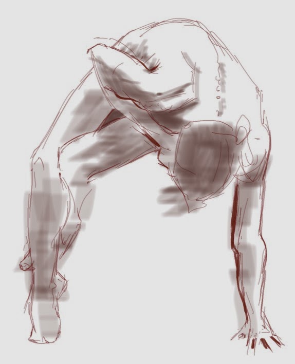
I'm continuing to work digitally in the Open Life Drawing Studio at Visual Arts Mississauga. I think it's really pushing me to improve my digital drawing and painting skills. A few examples from tonight's session, all done using SketchBook Pro and a Wacom tablet.


Friday, February 21, 2014

The Digital Life

I realize I haven't posted here for quite some time, but this seems like a good opportunity. I decided the time had come, and last night I took my computer and tablet to the Open Life Studio at Visual Arts Mississauga. Wow, was I ever pleased with both the results and the potential for the future.

It's a very different feel, working on a tablet with an active area of about 5 1/2" x 9" compared to an 18" x 24" pad on an easel. One of the advantages I was hoping for was to be able to do something more painterly in the longer last pose without the fuss of setting up painting materials and clean-up afterwards. It also meant a very easy switch between "tools," so I was able to move back and forth between pencil, marker, pen and wash. It made for a varied evening.

All of these examples were made using a Wacom Intuos Pro medium tablet and SketchBook Pro 6. Let me know in the comments what you think.


Monday, March 25, 2013

Figure Studies

I've really been enjoying the opportunities I've recently had to spend time drawing and painting from the figure. It's been quite a while since I spent any time in a figure class, and it's been great! Yesterday, for the first time in years, I got up the courage to take out the oils, and spent the afternoon with a bunch of friends making this small study. These are water miscible oils, as the studio in question doesn't allow solvents, and I like to have a thin, washy paint for the underdrawing. For the rest it's just paint straight from the tube and a tiny bit of oil to assist with flow.

This is small, 12x16, and it took me most of the 3 hour session to bring it to this stage. Overall, I'm very pleased with the visual quality, although it's not a particularly flattering portrait of the model. I'll be drawing her again at Visual Ats Mississauga's Open Studio life session on Thursday. These Thurdsay sessions have been extended through the spring, starting April 4th.

Below are some recent drawings from these sessions, done with carbon pencils and pastel pencils on toned paper.


Wednesday, January 30, 2013

Mixed Media

I've been considering trying to do something with oil pastels for a little while, and my friend Aleda O'Connor, who has worked with them for some time, was very encouraging. Much as I love Aleda's approach (and I urge you to check out her blog) I wanted to do something different with them.

Recently, with my acrylic landscapes, the surface texture of the painting has become more and more important to me, to the point where I now regularly texture my panels with various rough grounds and use thick paint where I can. I was hoping that using oil pastels over top of such an acrylic underpainting would yield some interesting results.

So, during a recent landscape class, I coated an acrylic underpainting with clear gesso and took the oil pastels to it. I was very pleased with the results.


I have also been looking for an approach to figure painting that would allow me a more expressive, gritty feel. I took an abandoned demo of a landscape underpainting and coated it with a pastel ground. I made a very rough, blocky carbon pencil drawing of a figure and overpainted thin acrylic washes to emphasize warm and cool areas, then went to town with the oil pastels. Again, I am very pleased with this little experiment, I think it shows a lot of promise.


Next, I'm going to try some still life or floral compositions, and see how those suit me. I may be on to my next obsession...

Tuesday, November 6, 2012

Shades of Gray

I had the pleasure of leading a drawing workshop on Saturday at the Neilson Park Creative Centre in Etobicoke. "Shades of Gray" focused on using various drawing media on toned paper. The idea here is to use the tone of the paper as an overall mid-tone, and draw in the darks and the lights. This challenges our ingrained habit of filling a white sheet with dark marks to indicate form, often with interesting results.

The first exercise was the old "make a circle look like a sphere," using charcoal or carbon pencils, wax-based coloured pencils, and "white charcoal" pencil. (If anyone knows what goes into making General's White Charcoal pencils, I would be very interested)  From the very beginning I encouraged the group to use line for basic layout purposes, but ultimately to pay more attention to the value masses, and how the relative lights and darks interact next to one another.


The next challenge was to draw a carton of eggs, and I don't think it made me any new friends... This one really showed that this technique requires the artist to think differently about representing values. There were times when it was more advantageous to add white to the shadow area of the eggs, because the midtone of the paper was too dark!


After a short lunch break, things were a little more open, with each artist choosing their own subject matter from a selection of reference photos: flowers, a portrait, a landsape, a dilapitated old barn, etc. I demonstrated an ink-wash technique during this time.


The focus and concentration was very intense, and the group tried a number of techniques, including brush drawing, pen drawing, and coloured  and watercolour pencil, often in combinations. They were a tired bunch by the end of the day, but they all felt very pleased with the work they had produced.


I must apologize to some of the participants if their work was not included in the post - my camera let me down, and I lost about half the shots I took. I am very sorry.